Courses/Computer Science/CPSC 203/CPSC 203 Template/Labs Template/TA Examples for Spreadsheets
Contents
- 1 TA Examples for Spreadsheets
- 2 Spreadsheet Examples
- 2.1 Navneet: Week 1 - Lab 1
- 2.2 Dina: Week 1 - Lab 1
- 2.3 Navneet: Week 1 - Lab 2
- 2.4 Ibrahim: Week 2 - Lab 1
- 2.5 Navneet: Week 2 - Lab 1
- 2.6 Navneet: Week 2 - Lab 2
- 2.7 Navneet and Ryan: Week 3 - Lab 1
- 2.8 King: Example Assignment 1 (Intro, Model, Presentation)
- 2.9 Fahim: Demonstrating Introduction, Model, and Data Dictionary (for assignment 1)
- 2.10 Abdelghani : What-If Analysis
- 2.11 - World Cup Equipment Rental Information - An Example
- 2.12 Soha: Week 1 and Week 2
- 2.13 Soha: Week 3
TA Examples for Spreadsheets
TAs please upload your examples of spreadsheet documents that explain concepts or help with skills. Also provide the following information:
- Your name
- What concept the spreadsheet file helps to explain
Spreadsheet Examples
- Navneet: Week 1 - Lab 1
- Concepts: sorting data and basic statistics
- Dina: Week 1 - Lab 1
- Concepts: filling out (numbers, date, formating, and functions). Format Cells and basic statistics
- Navneet: Week 1 - Lab 2
- Concepts: custom calculation, nested If-Then statement, pivot table, and lookup table
- Ibrahim: Week 2 - Lab 1
- Concepts: Creating Charts, Changing Data Source, Formatting Chart
- Navneet: Week 2 - Lab 1
- Concepts: creating charts and visual design
- Navneet: Week 2 - Lab 2
- Concepts: basic design rules and parts to a well organized spreadsheet
- Navneet and Ryan: Week 2 - Lab 2
- Concepts: analysis and text functions (count-if)
- Soha: Week 1 and Week 2
- Concepts: Calculations, if statement, pivot tables, lookup, vlookup, charts
- Soha: Week 3
- Review on all concepts
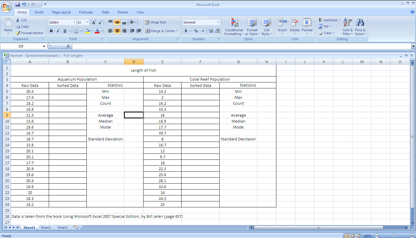
EXAMPLE. The spreadsheet below contains fish length data for two populations, Aquarium and Coral Reef. Download the spreadsheet and complete the following tasks, as well as answer the following questions:
- Tasks:
- Sort the data of the two populations in ascending order
- Calculate the min, max, count, average, median, mode, and standard deviation of each population
- Questions:
- What is the relation between the averages of the two populations?
- What is the standard deviation of each population?
- What is the range (min and max) and median of each population, and what is the relation of these values to the standard deviation of the their respective population?
- What is the mode of each population?
- How does Excel handle the case when there is more than one solution (hint: look at the ascending order of the data)?
- Create an example data set with no repeating numbers. When calculating the mode in this scenario what does Excel return?
Media: Navneet_-_Spreadsheet_Example_1_-_Fish_Lengths.xls
Dina: Week 1 - Lab 1
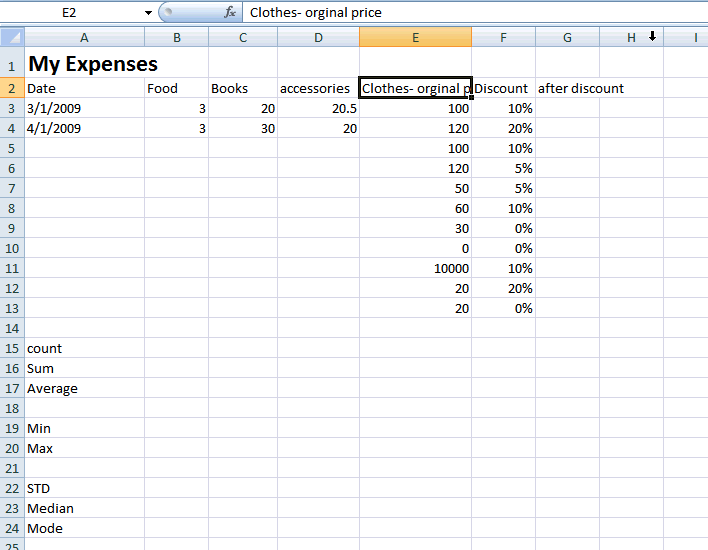
Example. The spreadsheet below contains incomplete expenses for 13 days.
- Tasks:
- Change the format of A3 to be March 1, 2009
- Fill out the Date till row 13
- Fill out the series at columns B, C, and D till row 13
- Change the formating of E2 to wrap text
- What if you use shrink to fit?
- Calculate the price of clothes after discount in cell G3 by entering the formula
- =E2-E2*F2
- Fill out column G3 till row 13, note that the new price is calculated for all cells.
- Change the format of D3 to be fraction. Fill out the column to apply the change for all cells.
- Calculate Basic measures for Food (count, sum, average, min, max, mode, STD, and median).
- Fill out all the previous measures to be calculated for other columns as well.
- Questions:
- Do you think that the average of column E is a good indicator about the data? Why? What about the median?
- How does Excel handle the case when there is more than one solution for Mode (Column E)?
- What is the median of the first 4 observations of Column E? Why?
- What is the summation of all the expenses?
- Hint: You should not include Columns E and F in your calculations.
Media:Dina_-Spreadsheet_Lab1_Example1.xls
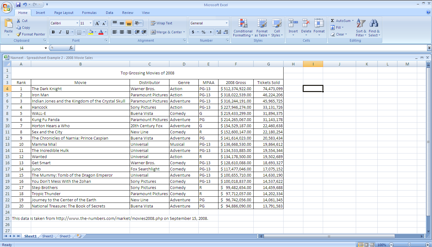
Example. The spreadsheet below contains movies sales data for 2008 (including movies that opened in 2007 and continued into 2008). Download the spreadsheet and complete the following tasks, as well as answer the following questions:
- Tasks:
- Implement a custom calculation that takes the cost of a single movie ticket, adds a $1.50 surcharge fee, and taxes of 5%
- Note: remember the order of mathematical operations when evaluating an expression, and use circular brackets when required for grouping subexpressions
- Implement a nested If-Then statement for each movie listed that incorporates the following; Blockbuster is greater than or equal to sales of $220 000 000, Hit is greater than or equal to sales of 150 000 000, and Success if less than sales of 150 000 000
- Note - don't forget to put double quotes " " around a string statement, e.g. "Blockbuster"
- Summarize data for Total, Average, and Max movie sales in a pivot table, organized with movie studios along the top row and movie genres along the left column
- Apply a lookup function to each movie, using the AutoFILL feature, to determine if it was a success, a hit, or a blockbuster (use the same ranges as defined in task two)
- Note: use absolute referencing (the symbol $ is used for absolute referencing in Excel) when using the AutoFILL feature to reference the same set of cells (where required) for each lookup function
- Implement a custom calculation that takes the cost of a single movie ticket, adds a $1.50 surcharge fee, and taxes of 5%
- Questions:
- What are the similarities and differences between If-Then statements and the Lookup function in Excel
Media: Navneet_-_Spreadsheet_Example_2_-_2008_Movie_Sales.xls
Ibrahim: Week 2 - Lab 1
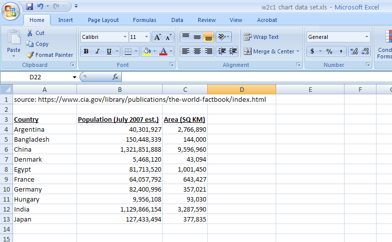
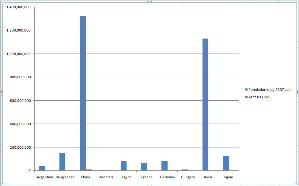
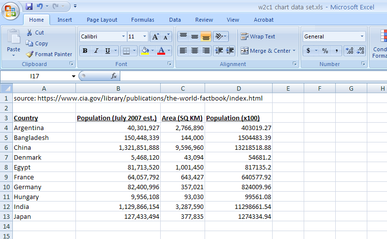
EXAMPLE. The spreadsheet given below contains the population (as of July 2007) and area in square kilometers for a few countries (source: CIA's The World Fact Book). Use this data to plot a 2D Bar chart for both the population and area against the country names.
Download This File: Media: W2c1_chart_data_set.xls
Then reformat the chart according to the instructions given below.
Preview:
- Tasks 1:
- Create a chart from the the data set provided, as shown below.
- Q - Why is this not a good chart?
- Task 2:
- Create a new column for the population in hundreds, as shown below.
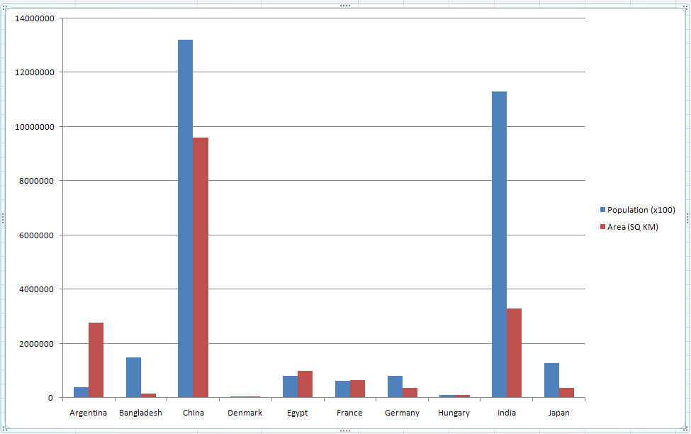
- Task 3:
- Change the chart's data source and title for the population from the current (on column B) to the newly created one (on column D). The new graphs should look something like this:
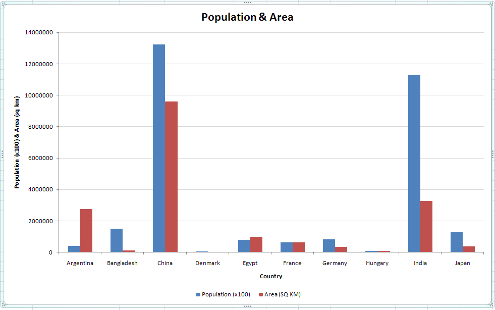
- Task 4:
- Add a title, axis labels, change the location of the legend on the chart and gray out the horizontal grid lines so that it looks something like this
- Chart Design:
- Q - How has the Golden Rectangle rule been adopted in the previews shown?
- Q - Why was a Bar chart used for this example instead of a Pie chart or a Line graph?
- Chart Evaluation:
- Q - Which of the countries given has
- the largest population ?
- the smallest population ?
- the largest area ?
- the smallest area ?
- more than a hundred people per square kilometer?
- less than a hundred people per square kilometer?
- Q - Which of the countries given has
Example. The spreadsheet below contains movies sales data for 2008 (including movies that opened in 2007 and continued into 2008). Download the spreadsheet and complete the following tasks, as well as answer the following questions:
- Tasks:
- Create a chart to display the total gross sales for each movie studio
- Use the appropriate tool(s) introduced in Week 1 - Lab 2 to help compile the data as required
- Create a chart to display the total gross sales for each genre
- Use the appropriate tool(s) introduced in Week 1 - Lab 2 to help compile the data as required
- For the most popular genre, create a chart that displays the total gross sales for each movie studio
- Use the appropriate tool(s) introduced in Week 1 - Lab 2 to help compile the data as required
- For each of the three charts, modify them to follow good visual design practice
- Create a chart to display the total gross sales for each movie studio
- Questions:
- For the first three tasks listed above, what are the most appropriate types of charts to be used, and the least appropriate types of charts to be used?
Media: Navneet_-_Spreadsheet_Example_2_-_2008_Movie_Sales.xls
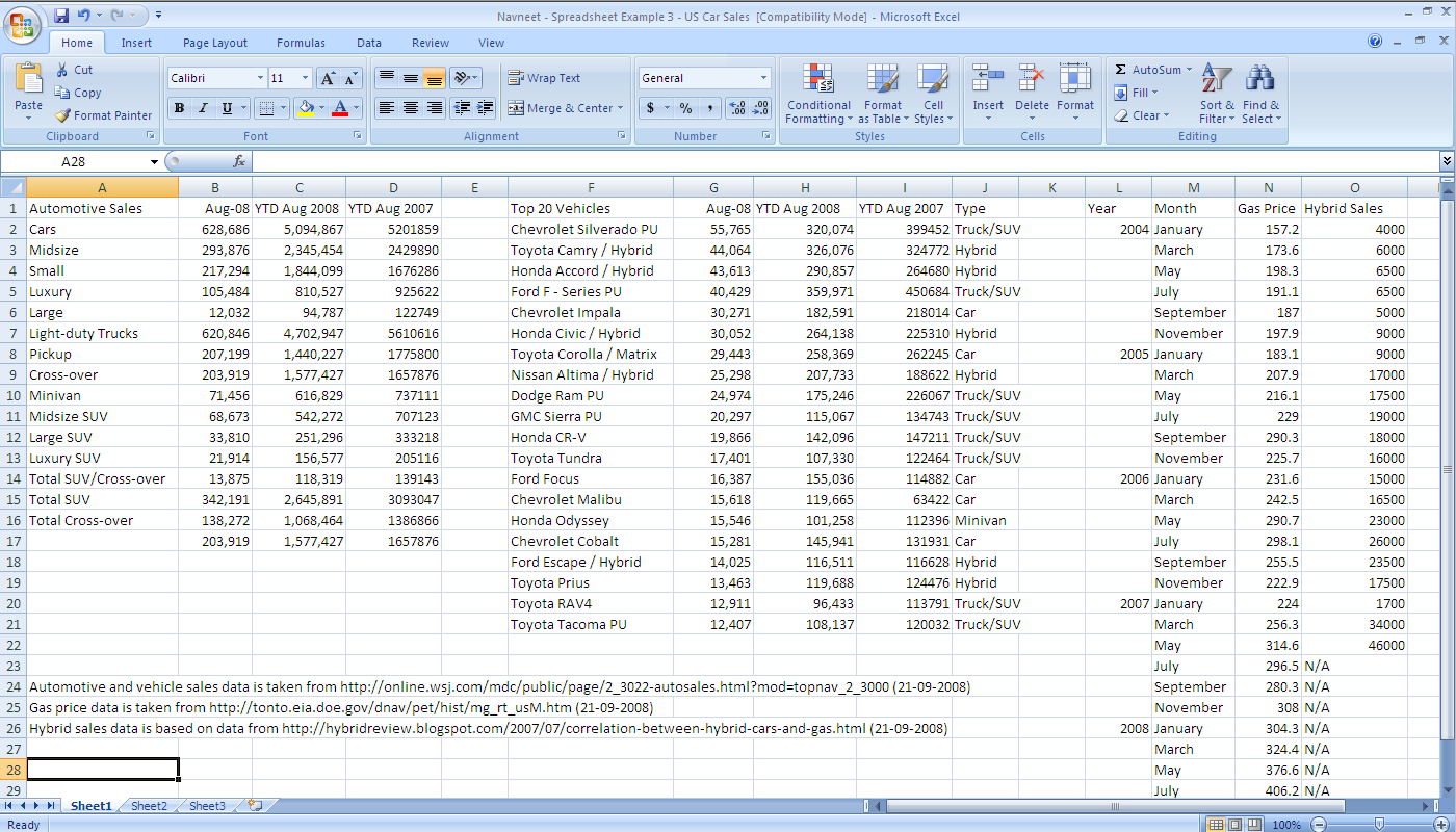
The spreadsheet below contains general automotive sales data, hybrid vehicle sales data, and gas prices for the U.S. market. Download the spreadsheet and complete the following tasks, as well as answer the following questions:
- Tasks:
- Organize the spreadsheet into seperate worksheets to include: introduction, model and assumptions, data dictionary, data, and presentation.
- Note - not all the raw data is required to complete the questions, remove any unnecessary raw data
- Note - if appropriate, use more than one data sheet, to organize corresponding data to answer the questions below
- Note - list the calculations used (even if they are very simple) in the model and assumptions sheet
- Format data appropriately (including converting gas prices in cents per US gallon to dollars per US gallon)
- Follow good visual design practices when creating any charts
- Organize the spreadsheet into seperate worksheets to include: introduction, model and assumptions, data dictionary, data, and presentation.
- Questions:
- What are the differences in year-to-date automotive sales until August 2008 in comparison to last year (for each type of car)? Use a chart to display this information.
- What are the differences in year-to-date vehicle sales until August 2008 in comparison to last year (for each of the top twenty vehicles)? Use a chart to display this information.
Media:Navneet_-_Spreadsheet_Example_3_-_US_Car_Sales.xls
The spreadsheet below contains general automotive sales data, hybrid vehicle sales data, and gas prices for the U.S. market. This exercise is a continuation to Navneet: Week 2 - Lab 2. Either download the spreadsheet below or continue using your formatted spreadsheet from the previous exercise, and complete the following tasks, as well as answer the following questions:
- Tasks
- Plot gas prices from January 2004 to May 2007
- Plot hybrid vehicle sales from January 2004 to May 2007
- Calculate the correlation between gas prices and hybrid vehicles sales from January 2004 to May 2007
- Hint: use Pearson product-moment correlation coefficient [[1]]
- Questions
- How many hybrid vehicles make up the top twenty vehicles sales?
- Note - use a count-if statement
- What are the market share percentages for the top twenty vehicle sales in August 2008? Use a chart to display this information.
- How weakly/strongly correlated are hybrid vehicles sales to the price of gas? What is the correlation coefficient?
- How many hybrid vehicles make up the top twenty vehicles sales?
Media:Navneet_-_Spreadsheet_Example_3_-_US_Car_Sales.xls
King: Example Assignment 1 (Intro, Model, Presentation)
In this example, I took data from the IMF and aggregated it with data from the US Election Atlas to try and see if a link existed between how well a party is doing with regards to economics, and whether or not that party stays in office for the next presidential term.
This was made available to my section on September 28th, in preparation for their Quiz/TBA1.
See Media:Elections.rename.to.xlsx.xls for the source.
Make sure that you can see filename extensions (e.g, the filename should display as "Elections.rename.to.xlsx.xls", and then rename it to "Elections.xlsx".
If you CANNOT see the .xls, that means you have to enable showing file extensions for your computer.
If you don't like this, complain to the people managing the Wiki and ask them to enable .xlsx as a file extension.
Fahim: Demonstrating Introduction, Model, and Data Dictionary (for assignment 1)
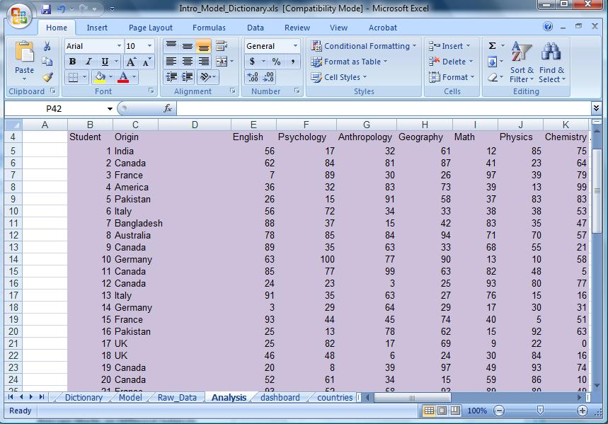
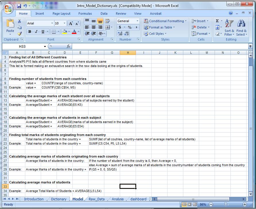
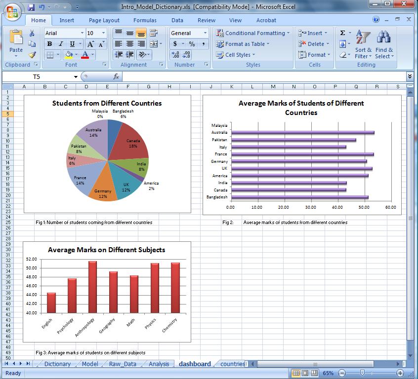
The spreadsheet below contains raw data about 50 students of a class. Students' countries of origin, and their marks in 7 different subjects are given. Some analysis on the data are done, and the results are presented in a dashboard of graph and charts. The goal of this work is to demonstrate the following as required in assignment 1:
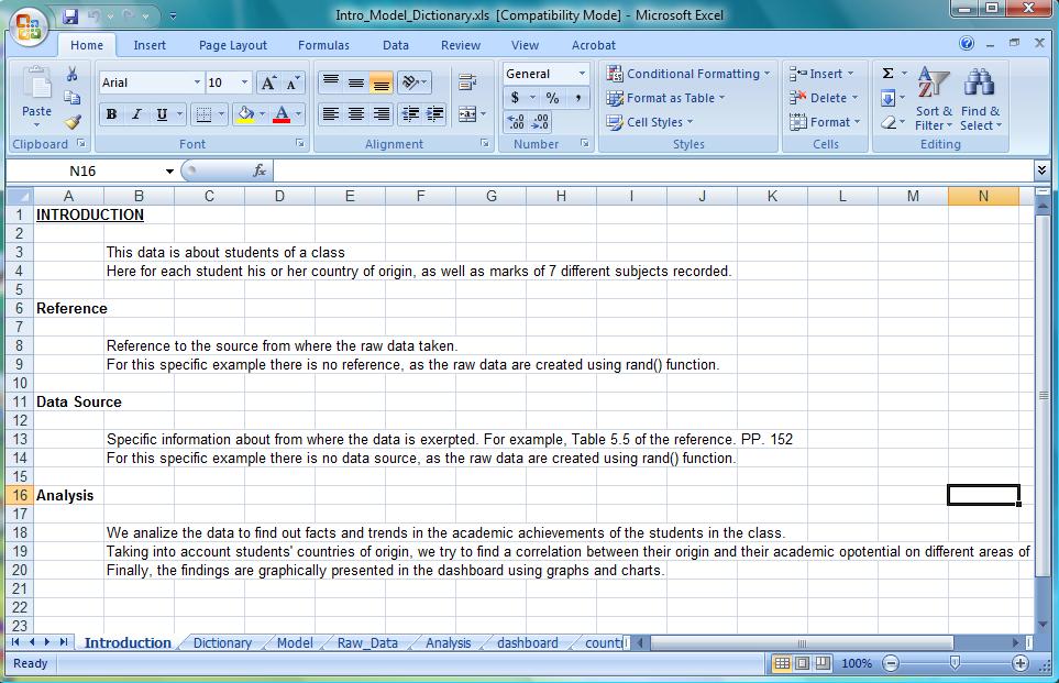
a. Introduction
b. Model
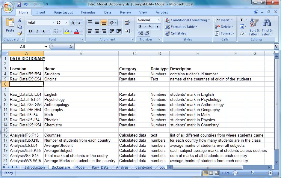
c. Data Dictionary
- Step 1: Get the raw data and minutely understand what they are about. Determine what sort of analysis you may do on the data. To do this ask yourself questions about the trend or facts might be found out from the data. This example considers questions such as,
- How different the average marks of students on different subjects?
- How is the comparative performance of students coming from different countries.
- Step 2: Introduction should introduce the data (what are they about), their source, what sort of analysis you would carry on the data and why.
- Step 3: Create a data dictionary. The data dictionary should describe all different chunks of data, their category (raw or summery data), type (number, text, etc), and a short description about what they represent.
- Step 4: Do analysis on data. In your analysis you will do mathematical or logical operations using formula and custom calculations. In the model explain all the calculations and operations you do as well as rational for doing those.
- Step 5: To present the findings of your analysis, create chart and graphs and place them in the dashboard. Add a pithy description for each of the figures you add. Additionally, you should have a brief description of your findings beside each figure (a few sentences). As an exercise, download the file for this example and work through the analysis step by step, then (a) think about if you could modify any step in the analysis, (b) use an alternate chart to summarize results and (c) produce a brief explanation of your conclusions based on each of the dashboard charts, immediately below the chart.
Media: Intro_Model_Dictionary.xls
For doing further analysis, one may for example, analyze the data to make a ranking of countries based on how good students of those countries did in mathematics.
Abdelghani : What-If Analysis
This example shows how to make different senarios for a monthly budget.
Scenarios help to see what will happen when one or several values in the data set change.
To Add/Edit/Delete a senario, you need to open Excel's Senario Manager by clicking on "Data" then on "What-If Analysis".
For more details, check Excel's Help
Four scenarios have been created.
Scenario 1- Current Budget
Balance = - $80
Scenario 2- Less Expenses :
For this senario the variables changed are: (Phone bill reduced to $40, Other decreased by $10)
Scenario 3- More Revenue :
For this senario the variable changed is: (Part time job money increased by $100)
Scenario 4- Less Expenses & More Revenue
For this senario the variables changed are: (Phone reduced to $40, Other decreased by $10 AND Part time job money increased by $100)
Now Lets see the new value of Balance for each senario.
This is the summary of the different senarios we have made.
To get a summary created for you by Excel; open up the Scenario Manager and click on summary. See previous picture.
- World Cup Equipment Rental Information - An Example
- You are provided with an initial spreadsheet data for World Cup Equipment Rental that contains information such as Item name, Supplier for the item, Catolgue Number for the item, Quantity, Cost Per Day, Delivery Day, Delivery Time, Delivery Location, Return Day, Return Time, Date Ordered.
- Task 1: Calculate the number of days an item is borrowed from the Delivery Day and Return Day
- Task 2: Calculate the total cost for each item [Hint: Total cost = Cost per Day x Number of Days x Quantity]
- Task 3: Calculate the total rental cost [Hint: Sum the total cost for all items]
- Task 4: Format the cells appropriately
- Task 5: Rename the current worksheet as Items
The final "Items" worksheet should look like the one below which calculates total rental cost by each supplier and total cost for all the items.
- Task 6: Create a new worksheet and name it as "rental_cost_by_supplier"
- Task 7: Now use IF condition to calculate the total rental cost for each supplier from Items worksheet. [Hint: IF(C$5=Items!$C7,Items!N7,0)]
- Task 8: Calculate the total rental cost for each supplier
- Task 9: Use appropriate chart to represent the rental cost per supplier
The final "rental_cost_by_supplier" worksheet should look like the one below.
- Task 10: You are given a budget of $22,000 (available budget) for this world cup event. Use appropriate chart to represent the available budget and
the budget used for the event. The chart may look like the one below. (You can choose to represent this information with any appropriate choice of your type).
References: The above example was given as an assignment to students when I used to TA for Prof. Frank Deur.
Soha: Week 1 and Week 2
- This sheet gives examples on:
- Calculations
- If statement simple and nested
- Lookup for fixed values, and within a range
- Vlookup
- Charts
- Pivot tables
Note that there are several sheets in the Excel file, where each sheet covers one of the mentioned topics. In every sheet, an example is given with its tasks
Soha: Week 3
- Review questions: Media: Soha_Spreadsheets_Exercise_w09.xls
- Review answers: Media: Soha_Spreadsheets_Exercise_Answers_w09.xls
